
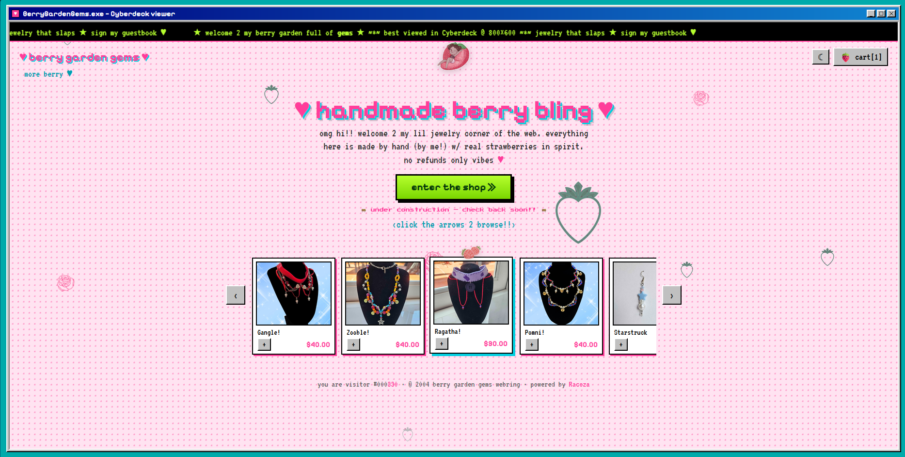
It's an online store for handmade jewelry, completely wrapped in strawberries, Y2K nostalgia, and the kind of early-internet chaos that would have been perfectly at home somewhere between GeoCities, a glittery MySpace profile, and the family computer you definitely weren't supposed to be using after midnight.
And after spending so much time around modern websites, it was such a nice change of pace.
When Did Every Website Start Looking the Same?
AI has its uses. It's a tool used by many. It has completely changed how quickly we can design, prototype, code, and experiment.
But we do need to admit something.
AI has become very good at making the same website.
You know the one.
Big hero section. Rounded cards. Tasteful gradient. Three columns explaining the product. Maybe a slightly translucent navigation bar floating at the top. Everything perfectly spaced. Everything very clean.
Everything somehow looking like a startup that just raised $14 million.
There's nothing wrong with that style, but after seeing the hundredth variation of it, you start craving something with a little personality.
Berry Garden Gems gave me permission to go in the exact opposite direction.
Welcome to Berry95
We went through a few early concepts, but eventually threw the alternatives out and committed completely to what we started calling Berry95.
That was when the project really became fun.
Instead of trying to make a modern storefront with a retro color palette, we wanted the website itself to feel like a little artifact from another version of the internet.
The whole shop lives inside a big pink Netscape-style browser window.
Strawberries fall down the screen.
A ridiculous little marquee races across the top with Y2K copy.
The background is covered in dense red dots.
The product carousel has chunky little ‹ › controls instead of trying to pretend it is some incredibly sophisticated piece of interface design.
It's pink. It's green. It's a little loud.
It's supposed to be.
And somehow it works perfectly for handmade strawberry jewelry.
The Best Part Was Letting It Be a Little Silly
Modern design teaches us to remove things.
Reduce the visual noise. Simplify the interface. Make the animation subtle. Keep the experience predictable.
Berry95 kept asking the much more entertaining question:
"Okay, but what if we added falling strawberries?"
So we did.
Then we added more berries, berries wherever I could, and even shooting stars every 30 seconds.
This project was exactly what I needed after spending so much time on the bureaucratic necessities that come with making my silly little games.
It reminded me that art and design are supposed to be fun.
Of Course It Has Dark Mode
This may be a website inspired by the era when people thought flashing text was an accessibility feature, but we are still living in 2026.
So Berry95 also has a dark mode.
Instead of simply turning everything black, we built a darker version of the same personality using deep ruby reds, crimson framing, and almost-black dots.
Because if you're going to give a GeoCities-inspired strawberry jewelry store enterprise-grade theming controls, you might as well commit to the bit.
The Tiny Details Ended Up Being My Favorite Part
A surprising amount of the work wasn't about the big idea. It was about getting all of the intentionally messy things to behave properly.
The scrolling marquee, for example, needed to look like something someone would have proudly put on their homepage in 2001 while actually scrolling smoothly on a modern browser.
The strawberries needed to fall without completely taking over the page.
The dots needed to be dense enough to feel slightly ridiculous without making everything unreadable.
The carousel needed to feel old-school without actually being annoying to use.
That balance became the entire project: make it nostalgic without making it bad.
There's a difference.
The Weirdness is What Made This Fun
Instead of spending all of our time implementing basic functionality, we could spend more time asking increasingly specific questions.
What if the berries fell straighter?
What if the marquee moved faster?
What if dark mode looked like a ruby CRT nightmare?
What if we added controls to help us decide how chaotic the website is?
What if the heading colors changed independently?
What if a shooting star fell across the screen every 30 seconds?
Next Up: Actually Building the Store
The Berry95 homepage is now alive, tweakable, and appropriately covered in strawberries.
The next stage was turning all of this into the full Berry Garden Gems shopping experience: a proper product grid, individual product pages, a shopping cart, and the rest of the store.
The product cards are already designed around easy drop-in image placeholders, so the foundation is there. And even though the site looks old, it has a ton of functional modern features that make the site easy to use.
Berry can log in and add products herself seamlessly, and she can schedule posts to her social media pages right from the same panel using the same product listings she just made.
But I really don't want to lose the weirdness as the site gets bigger.
The goal isn't to build a normal ecommerce site and put strawberries on it.
The goal is to make you feel like you just discovered a tiny handmade jewelry shop hiding in some forgotten corner of the 2000s internet.
Except this time the shopping cart actually works.
And to be completely honest?
I missed websites like this.